Introduction
MAC-seq is a cost-effective, high-throughput transcriptomic platform, developed as a collaboration between Victorian Centre for Functional Genomics (VCFG) and Molecular Genomics Core (MGC) facilities at Peter MacCallum Cancer Centre (Peter Mac), primarily designed for small molecule screening. However, its versatility extends beyond this application, thanks to its integration with high-throughput microscopy and 3D cell culturing techniques.
macpie is a toolkit designed for researchers, originally with MAC-seq data in mind, but validated for general High-Throughput Transcriptomics (HTTr) data applications. Its primary aim is to deliver the latest tools for quality control (QC), visualization, and analysis. macpie is a result of a collaborative effort by a workgroup at the PeterMac, with a substantial support of the VCFG amd MGC core facilities.
In this vignette we cover the basic functionality of macpie, from input, quality control to transcriptional and screen-related analyses. For more in-depth workflows, please refer to other vignettes:
- Quality control
- Transcriptional analysis
- Compound screening
- Cross-platform compatibility
- Assessing sparsity
- Working with Bioconductor classes
1. Metadata import and QC
Key points:
- metadata has to contain at least columns Plate_ID, Well_ID, Row, Column, Species, Sample_type, Treatment_1, Concentration_1 and Barcode.
Metadata has to be in a tabular format and contain a standardised set of columns to define coordinates of a sample on a plate, provide minimum information about the sample, and allow connection with the transcriptomic data through the sample barcodes.
To ensure the integrity of metadata for future analyses, we provide the user with a set of tools to verify metadata consistency and visualize the key variables, described in more depth in the QC vignette. We will first visually inspect all experimental variables, in order to identify potential artefacts.
#install.packages("macpie")  # or devtools::install_github("PMCC-BioinformaticsCore/macpie")
library(macpie)
library(enrichR)
library(randomForest)
library(pheatmap)
library(ggrepel)

# Load metadata
project_metadata <- system.file("extdata/PMMSq033_metadata.csv", package = "macpie")

# Load metadata
metadata <- read_metadata(project_metadata)
plot_metadata_heatmap(metadata)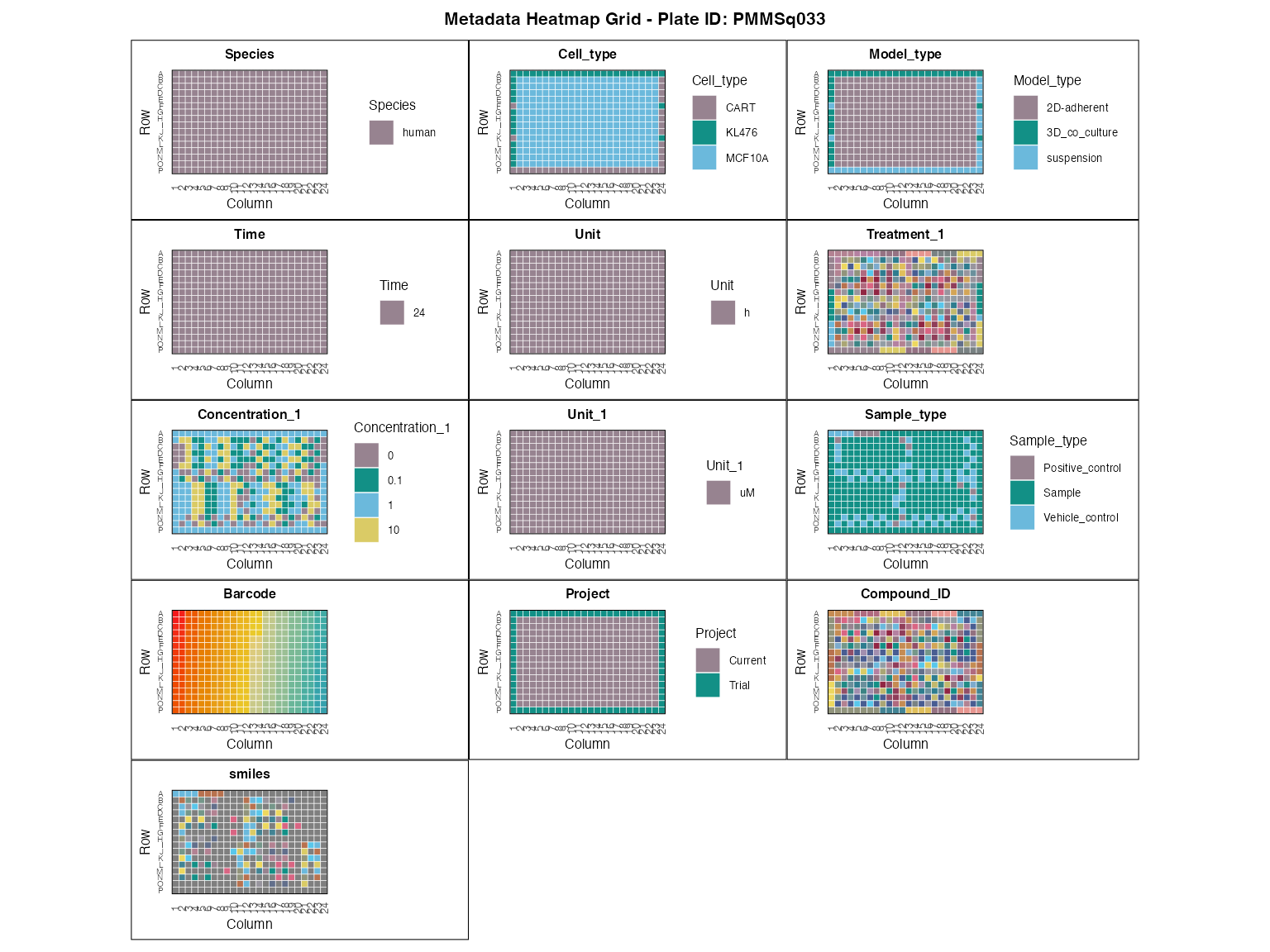
Key Lessons for Robust Experimental Design
Based on our experience, the specific metadata you need will vary greatly with your experiment’s design. Here are some crucial lessons we’ve learned to help you achieve reliable results:
Plate Layout Matters: Always place replicate sample wells on the same assay plate, not across multiple plates.
Minimum Replicates: Aim for a minimum of 3 replicates per condition to ensure statistical robustness.
Strategic Negative Controls: For negative control wells, we recommend including 10 wells randomized across the same assay plate. This provides a more robust baseline.
2. Sequencing data import and QC
Key points:
- pay special attention to removal of lowly expressed genes and then:
- use plot_plate_layout to check plate-level effects (edge vs centre, between plates)
- use plot_mds to check sample grouping (umap/pca is also available using Seurat’s functions)
- use compute_qc_metrics, plot_qc_metrics_heatmap, and plot_distance to check sample variability and outliers
- use plot_rle to check any row/column/plate effects and compare normalization methods
- more detailed methods available in vignette Quality control
2.1 Import data to tidySeurat object
Data access:
- load your raw counts by providing Read10X function with a path to a directory containing matrix.mtx.gz, barcodes.tsv.gz, and features.tsv.gz, commonly “raw_matrix” from CellRanger or StarSolo output
- the full manuscript dataset (>10 MB of
.rdsfiles) is currently under restricted release and will become publicly available upon publication (at Zenodo). In the meantime, please contact us for early access - use data(mini_mac) to load a subsample (308 samples, 500 genes) of the full dataset, as in the commented code below
# 1. Load your own gene counts per sample or 2. data from the publication
project_rawdata <- paste0(dir, "/macpieData/PMMSq033/raw_matrix")
project_name <- "PMMSq033"
raw_counts <- Read10X(data.dir = project_rawdata)

# Create tidySeurat object
mac <- CreateSeuratObject(counts = raw_counts,
                          project = project_name,
                          min.cells = 1,
                          min.features = 1)

# 3. Alternatively, load a premade example:
# data(mini_mac)
# mac <- mini_mac

# Join gene counts per sample with metadata
mac <- mac %>%
  inner_join(metadata, by = c(".cell" = "Barcode"))

# Create unique identifier for your treatments based on metadata
mac <- mac %>%
  mutate(combined_id = str_c(Treatment_1, Concentration_1, sep = "_")) %>%
  mutate(combined_id = gsub(" ", "", .data$combined_id)) %>%
  mutate(combined_id = make.names(combined_id))

# # Filter by read count per sample group
mac <- filter_genes_by_expression(mac,
                                  group_by = "combined_id",
                                  min_counts = 5,
                                  min_samples = 1)
2.2 Basic QC metrics
macpie allows you to use the common QC plots from the Seurat package to visualise the number of genes, reads, and percentage of mitochondrial and ribosomal genes per sample.
# Calculate the percent of mitochondrial and ribosomal genes
mac[["percent.mt"]] <- PercentageFeatureSet(mac, pattern = "^mt-|^MT-")
mac[["percent.ribo"]] <- PercentageFeatureSet(mac, pattern = "^Rp[slp][[:digit:]]|^Rpsa|^RP[SLP][[:digit:]]|^RPSA")

# Example of a function from Seurat quality control
VlnPlot(mac, features = c("nFeature_RNA", "nCount_RNA", "percent.mt", "percent.ribo"),
        ncol = 4, group.by = "Sample_type") &
scale_fill_manual(values = macpie_colours$discrete) 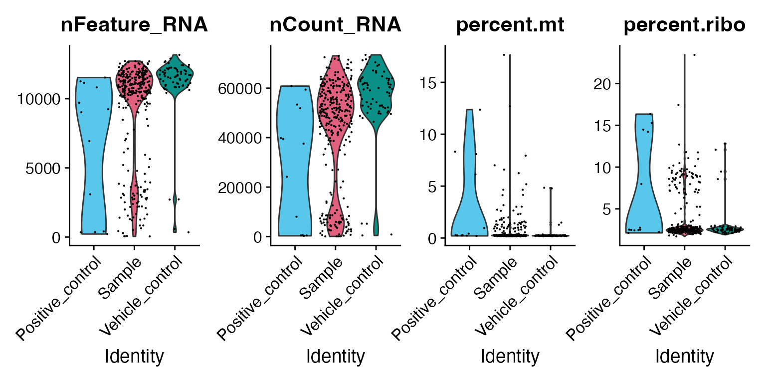
In addition, you can apply tidyverse functions to further explore the dataset. For example, let’s subset the Seurat object based on the column “Project” in the metadata and visualise the grouping of data on the plate vs on an MDS plot. Plate layout plots provide an interactive way to inspect spatial patterns across a plate, helping to identify anomalies or unexpected trends. When hovering over the plot, sample groups are automatically highlighted to aid interpretation.
unique(mac$Project)
#> [1] "Trial"   "Current"
mac <- mac %>%
  filter(Project == "Current")

# Interactive QC plot plate layout (all metadata columns can be used):
p <- plot_plate_layout(mac, "nCount_RNA", "combined_id")
girafe(ggobj = p,
  fonts = list(sans = "sans"),
  options = list(
    opts_hover(css = "stroke:black; stroke-width:0.8px;")  # <- slight darkening
  ))
2.2.1 Sample grouping with MDS plot
In order to assess sample grouping, we should visualise sample similarity based on the limma’s MDS (MultiDimensional Scaling) function. Samples that are treated with a lower concentration of compound will often cluster close to the negative (vehicle) control. Hovering over the individual dots reveals sample identity and grouping.
2.2.2 Distribution of read counts
Visualising distribution of read counts across treatments is an easy way to compare the effects of treatments and estimate sample variability. Read count is commonly directly proportional to the number of cells.
qc_stats <- compute_qc_metrics(mac, group_by = "combined_id", order_by = "median")2.2.3 Variability among all replicates
In relation to the previous plot, we want the user to have the ability to quantify the dispersion of reads between sample replicates. Therefore, we provide access to several statistical metrics such as standard deviation (sd_value), z score (z_score), mad (mad_value) and IQR (IQR) which can be used as a parameter to the function plot_qc_metrics individually, or assessed at once with the function plot_qc_metrics_heatmap.
plot_qc_metrics_heatmap(qc_stats$stats_summary)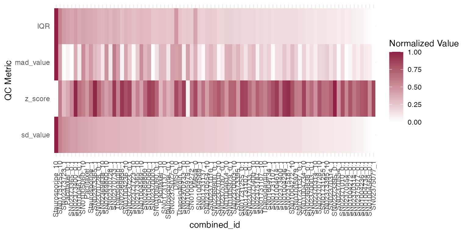
Identifying outliers and batch effects, especially in the untreated samples, is especially important for downstream analysis. For further statistical methods to quantify variability among sample groups and inter-replicate variability please refer to vignette Quality control.
2.2.4 Correction of the batch effect
Several methods are available for scaling and normalizing transcriptomic data, with their effects most clearly visualized using RLE (Relative Log Expression) plots. In our case, limma_voom provides the lowest average coefficient of variation, when compared to other methods such as “raw”, Seurat “SCT” or “edgeR”.
# First we will subset the data to look at control, DMSO samples only
mac_dmso <- mac %>%
  filter(Treatment_1 == "DMSO")

# Run the RLE function
plot_rle(mac_dmso, label_column = "Row", normalisation = "limma_voom")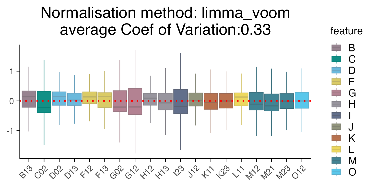
3. Differential gene expression
Key points:
- use compute_single_de to perform a differential expression analysis for one treatment group vs control
- use compute_multi_de to perform differential expression analyses for all treatment groups vs control
- use volcano plot, box plot and heatmap to show results from the
analyses and visualise gene expression levels
- use enrichr for pathway enrichment analysis
- more detailed methods available in vignette Transcriptional analyses
3.1. Single comparison
Similar to RNA-seq, the quality of differential gene expression analysis in MAC-seq depends on low variability among replicates and the suitability of the statistical model. These aspects are assessed during the quality control stage of the workflow.
Results of differential expression analysis are classically visualised with a volcano plot.
# First perform the differential expression analysis
treatment_samples <- "Staurosporine_10"
control_samples <- "DMSO_0"
top_table <- compute_single_de(mac, treatment_samples, control_samples, method = "limma_voom")

# Let's visualise the results with a volcano plot
plot_volcano(top_table, max.overlaps = 16)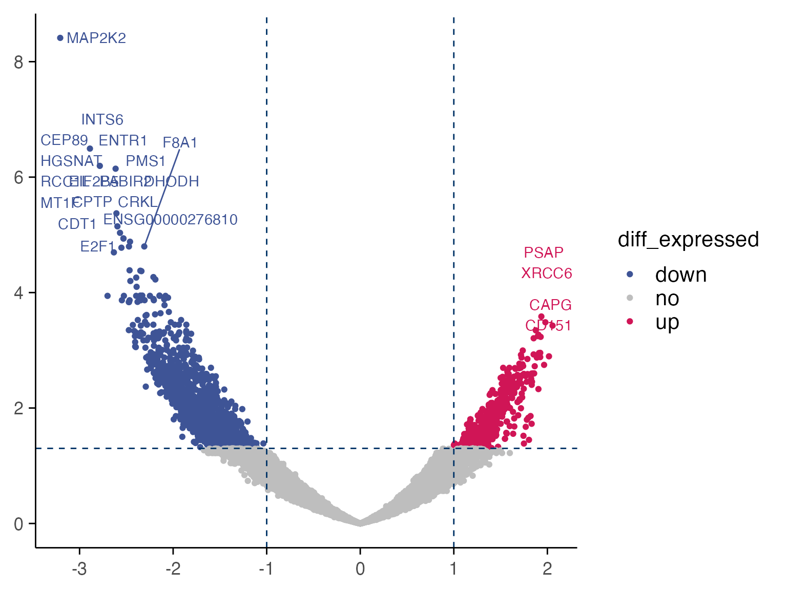
Based on the results, we can quickly check gene expression levels in counts per million (CPM) for selected genes between treatment and control samples as described below.
genes <- top_table$gene[1:6]
group_by <- "combined_id"
plot_counts(mac, genes, group_by, treatment_samples, control_samples, normalisation = "cpm", color_by = "combined_id")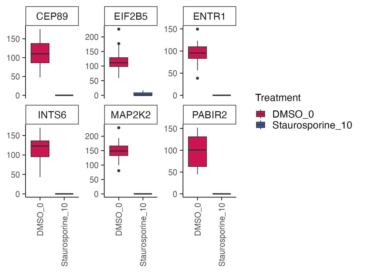
3.2. Pathway analysis
Differential gene expression results for individual comparisons of treatment vs control are usually performed with functions from package enrichR and fgsea. In the following case, the effect of Staurosporine on breast cancer cells through Myc inactivation can be observed through pathway enrichment analyses.
top_genes <- top_table %>%
  filter(p_value_adj < 0.01) %>%
  select(gene) %>%
  pull()

enriched <- enrichR::enrichr(top_genes, c("MSigDB_Hallmark_2020"))
#> Uploading data to Enrichr... Done.
#>   Querying MSigDB_Hallmark_2020... Done.
#> Parsing results... Done.
p1 <- enrichR::plotEnrich(enriched[[1]]) +
  macpie_theme(legend_position_ = 'right') +
  scale_fill_gradientn(colors = macpie_colours$divergent)

gridExtra::grid.arrange(p1, ncol = 1)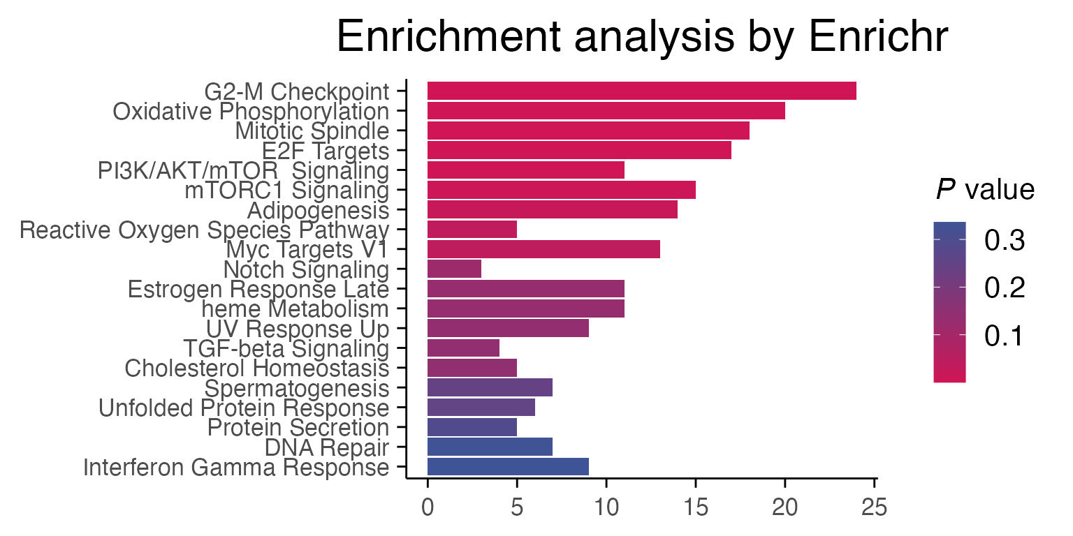
3.3. Differential gene expression - multiple comparisons
Since MAC-seq is commonly used for high-throughput screening of compound libraries, we often want to compare multiple samples in a screen vs the control. This process can easily be parallelised. First we select a vector of “treatments” as combined_ids that do not contain the word “DMSO”. (Warning, due to the limitations of “mclapply”, parallelisation speedup currently only works on OSX and Linux machines, and not on Windows.)
# Filter out lower concentrations of compounds and untreated samples
treatments <- mac %>%
  filter(Concentration_1 == 10) %>%
  select(combined_id) %>%
  filter(!grepl("DMSO", combined_id)) %>%
  pull() %>%
  unique()
mac <- compute_multi_de(mac, treatments, control_samples = "DMSO_0", method = "limma_voom", num_cores = 1)
We often want to ask which genes are differentially expressed in more than one treatment group.
Here, we can visualise treatment groups with shared differentially expressed genes, defined as the top 5 DE genes from each single drug comparison (treatment vs control) that are found in at least 2 different treatment groups.
The heatmap below shows shared differentially expressed genes with corresponding log2FC values.
plot_multi_de(mac, group_by = "combined_id", value = "log2FC", p_value_cutoff = 0.01, direction="up", n_genes = 5, control = "DMSO_0", by="fc")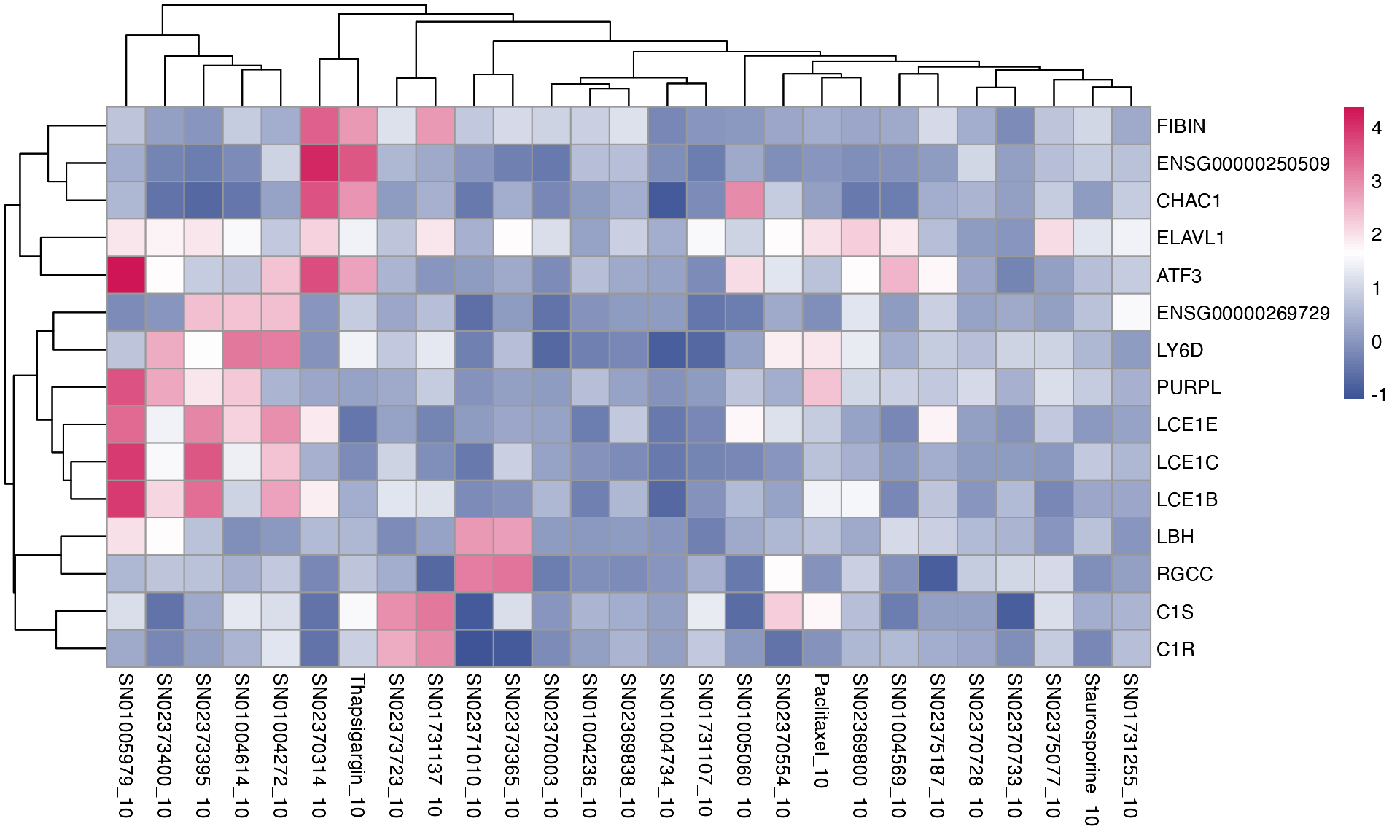
3.4. Pathway analysis - multiple comparisons
The pathway enrichment analysis is done with R package enrichR, and can be summarised with a heatmap, visualising direct and offtarget effects of the perturbations.
# Load genesets from enrichr for a specific species or define your own
enrichr_genesets <- download_geneset("human", "MSigDB_Hallmark_2020")
mac <- compute_multi_enrichr(mac, genesets = enrichr_genesets)

enriched_pathways_mat <- mac@tools$pathway_enrichment %>%
  bind_rows() %>%
  select(combined_id, Term, Combined.Score) %>%
  pivot_wider(names_from = combined_id, values_from = Combined.Score) %>%
  column_to_rownames(var = "Term") %>%
  mutate(across(everything(), ~ ifelse(is.na(.), 0, log1p(.)))) %>%  # Replace NA with 0 across all columns
  as.matrix()

pheatmap(enriched_pathways_mat, color = macpie_colours$continuous_rev)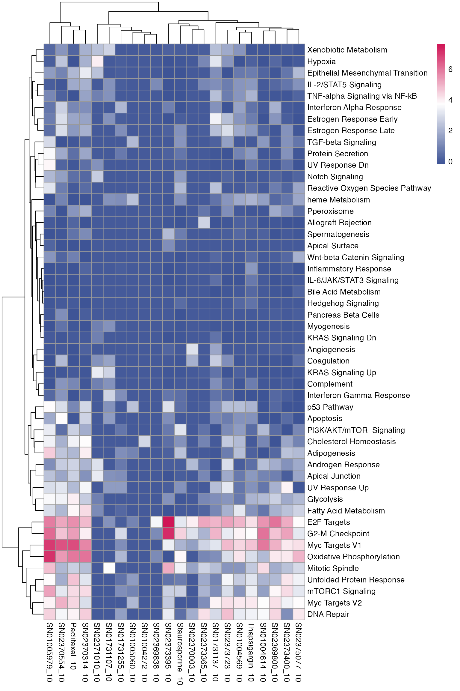
4. Methods for compound screening
Key points:
- use plot_de_umap to find compounds that behave similarly based on proximity on UMAP maps
- use compute_single_dose_response to evaluate impact of compound concentrations on gene expression or pathway enrichment
- use compute_multi_screen_profile to find perturbations similar to your target profile or a known gene set
- more detailed methods available in vignette Compound screening
4.1. UMAP clustering based on DE genes
Instead of plotting UMAP on individual samples, we can also visualise the samples on UMAP of differential gene expression vs control. This allows us to use batch-corrected data and reduce replicate noise, while showing the grouping of treatments.
mac_agg <- aggregate_by_de(mac)
mac_agg <- compute_de_umap(mac_agg)
mac_agg <- FindNeighbors(mac_agg, reduction = "umap_de", dims = 1:2)
mac_agg <- FindClusters(mac_agg, resolution = 1.3)
#> Modularity Optimizer version 1.3.0 by Ludo Waltman and Nees Jan van Eck
#>
#> Number of nodes: 27
#> Number of edges: 351
#>
#> Running Louvain algorithm...
#> Maximum modularity in 10 random starts: -0.0139
#> Number of communities: 18
#> Elapsed time: 0 seconds

cell_coords <- Embeddings(mac_agg, reduction = "umap_de") %>%
  as.data.frame() %>%
  rownames_to_column("combined_id") %>%
  left_join(mac_agg@meta.data, by = "combined_id")

# Plot with clusters and labels
ggplot(cell_coords, aes(x = UMAPde_1, y = UMAPde_2, color = seurat_clusters)) +
  geom_point(size = 2) +
  geom_text_repel(aes(label = combined_id), size = 3, max.overlaps = 10, force_pull = 1) +
  theme_minimal() +
  guides(color = guide_legend(title = "Cluster")) +
  labs(x = "UMAP 1", y = "UMAP 2", title = "UMAP with Cell Names") +
  theme(legend.position = "right")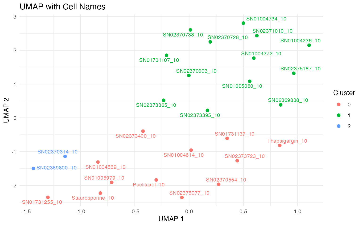
4.2. Similarity to a treatment profile or phenotype
Additionally, when performing a screen, sometimes we want to measure similarity to either an existing profile, or to a user-defined gene-set that defines a desired phenotype.
mac <- compute_multi_screen_profile(mac, target = "Staurosporine_10", num_cores = 1)
mac_screen_profile <- mac@tools$screen_profile %>%
  mutate(logPadj = c(-log10(padj))) %>%
  arrange(desc(NES)) %>%
  mutate(target_id = factor(target_id, levels = unique(target_id)))

ggplot(mac_screen_profile, aes(target_id, NES)) +
  #geom_point(aes(size = logPadj)) +
  geom_point() +
  facet_wrap(~pathway, scales = "free") +
  macpie_theme(x_labels_angle = 90, show_x_title = F)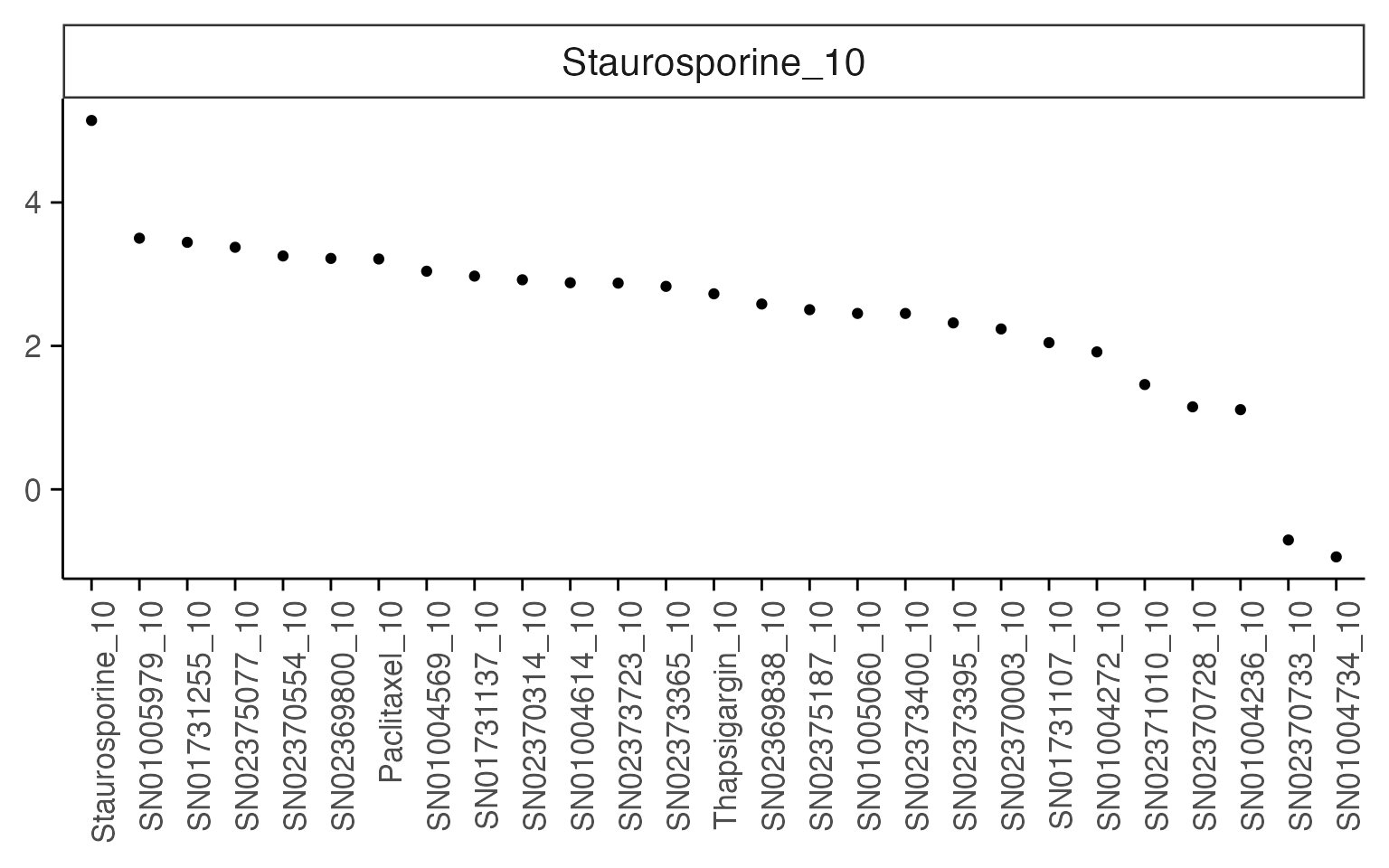
4.3. Estimate of dose-response
macpie can be used to calculate dose-response curves for individual genes, pathways or any other external measurement such as cell viability that is available in your metadata, based on the R package drc These are also available in a paralelisable format with the function “compute_multiple_dose_response”.
treatments <- mac %>%
  select(combined_id) %>%
  filter(!grepl("DMSO", combined_id)) %>%
  pull() %>%
  unique()
mac <- compute_multi_de(mac, treatments, control_samples = "DMSO_0", method = "limma_voom", num_cores = 1)
mac <- compute_multi_enrichr(mac, genesets = enrichr_genesets)
res <- compute_single_dose_response(data = mac,
  gene = "SOX12",
  normalisation = "limma_voom",
  treatment_value = "Staurosporine")
#>
#> Estimated effective doses
#>
#>        Estimate Std. Error    Lower    Upper
#> e:1:50  0.14865    0.28684 -0.44335  0.74066
res$plot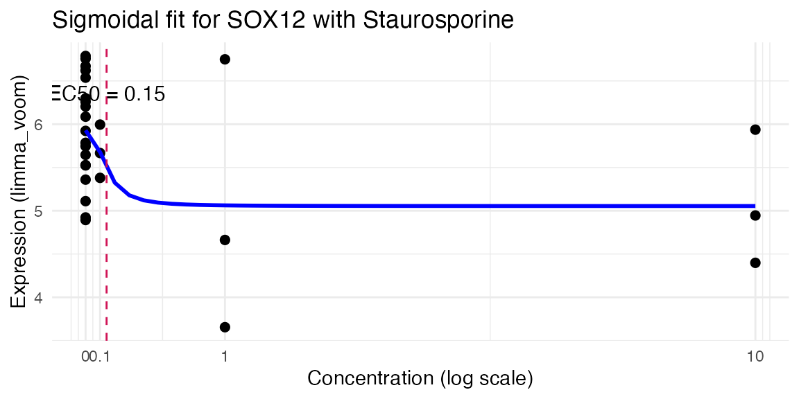
res <- compute_single_dose_response(data = mac,
  pathway = "Myc Targets V1",
  treatment_value = "SN01005979")
#>
#> Estimated effective doses
#>
#>        Estimate Std. Error Lower Upper
#> e:1:50   2.9958    10.0000   NaN   NaN
res$plot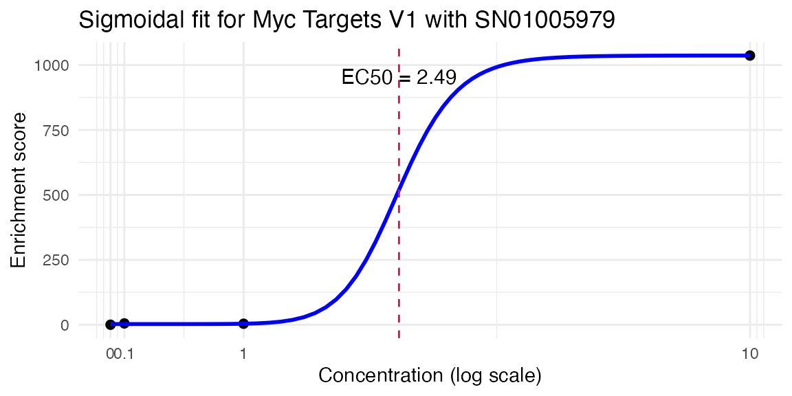
4.4. Working with chemical descriptors
macpie provides an easy way to find smiles from compounds names, compute chemical descriptors of the compounds and identify those that are most important for the phenotype.
In the example below, the number of rings on the structures is the most important for targeting the estrogen activity.
# Add smiles based on a column with generic names of compounds
#(warning, this process requires internet connection and can take a while)
mac <- compute_smiles(mac, compound_column = "Compound_ID")

# Calculate descriptors
mac <- compute_chem_descriptors(mac)

#change column names for joining
colnames(mac@tools$chem_descriptors)[1] <- "combined_id"

# Join with target variable (e.g. pathway score)
model_df <- mac@tools$pathway_enrichment %>%
  filter(Term == "Estrogen Response Early") %>%
  left_join(., mac@meta.data, join_by(combined_id)) %>%
  filter(Concentration_1 == 10) %>%
  select(Treatment_1, Combined.Score, combined_id) %>%
  unique() %>%
  left_join(., mac@tools$chem_descriptors, join_by(combined_id)) %>%
  select(-combined_id) %>%
  drop_na()

# Train random forest
rf_model <- randomForest(Combined.Score ~ ., data = model_df, importance = TRUE, na.action = na.omit, ntrees = 500)

# Get importance scores
rf_importance <- importance(rf_model, type = 1)  # %IncMSE = predictive power
rf_ranked <- sort(rf_importance[, 1], decreasing = TRUE)

# Top 20 important descriptors
head(rf_ranked, 20)
#>   topoShape      WTPT.5     MDEO.22 nRingBlocks  nAromRings     MDEN.22
#>   2.7680771   2.2364722   1.6972571   1.4258409   1.1249207   1.0010015
#>    khs.ssNH    khs.aasN nAromBlocks     nRings4     nRings7     MDEN.11
#>   0.4018917   0.1164148   0.0000000   0.0000000   0.0000000   0.0000000
#>     MDEN.33     khs.tCH    khs.dsCH      khs.sF    khs.dssS     khs.sCl
#>   0.0000000   0.0000000   0.0000000   0.0000000   0.0000000   0.0000000
#>      WTPT.2   khs.ssCH2
#>  -0.4664402  -0.7927457
#>      WTPT.2     nRings5     MDEC.11     nRings7     MDEO.22     MDEO.11
#> 3.361393653 2.150421361 1.214784237 1.001001503 0.783327367 0.709299485
#>   khs.ssCH2 nSmallRings     MDEN.33     MDEC.14   topoShape      ALogp2
#> 0.474955644 0.366086694 0.115293479 0.085759728 0.077678537 0.007617685
#>     nRings4     MDEN.11    khs.dCH2     khs.tCH     khs.dNH    khs.aaNH
#> 0.000000000 0.000000000 0.000000000 0.000000000 0.000000000 0.000000000
#>     khs.dsN     khs.aaO
#> 0.000000000 0.000000000
varImpPlot(rf_model, n.var = 20, main = "Top 20 Random Forest Features", type = 2)