This vignette focuses on metadata and data quality control, which can have a substantial impact on downstream analyses and interpretation in a high-throughput screen environment. We first demonstrate metadata import and validation, ensuring sample annotations are complete and ready for subsequent analyses. After loading raw gene expression data, either from single or multiple plates, we integrate data with metadata, and perform a series of QC checks to assess technical variability, detect anomalies, and correct for batch effects. Special attention should be taken to assess variability of samples that will be used across differential gene expression analysis, such as DMSO-treated or untreated samples.
1. Metadata import and validation
As part of the macpie package, we provide a set of functions to import and validate metadata. The metadata file should contain all the information about the samples, including sample names, experimental conditions, and other relevant variables. The metadata file has to be in a tabular format, and while it can contain any information relevant for the user, it should at least contain columns Plate_ID, Well_ID, Row, Column, Species, Sample_type, Treatment_1, Concentration_1 and Barcode.
Key points:
- use validate_metadata to check the metadata file for common errors
- use plot_metadata_heatmap to visually inspect metadata integrity
1.1 Metadata input
#install.packages("macpie")  # or devtools::install_github("PMCC-BioinformaticsCore/macpie")
library(macpie)

# Define project variables
project_name <- "PMMSq033"
project_metadata <- system.file("extdata/PMMSq033_metadata.csv", package = "macpie")
# Load metadata
metadata <- read_metadata(project_metadata)
#metadata <- read_metadata(project_metadata)
1.2 Check column names
colnames(metadata)
#>  [1] "Plate_ID"        "Well_ID"         "Row"             "Column"
#>  [5] "Species"         "Cell_type"       "Model_type"      "Time"
#>  [9] "Unit"            "Treatment_1"     "Concentration_1" "Unit_1"
#> [13] "Sample_type"     "Barcode"         "Project"         "Compound_ID"
#> [17] "smiles"
1.3 Validate metadata
The validate_metadata function will check the metadata
file for common errors, such as missing values, incorrect data types,
and other potential issues. It will also provide a summary of the
metadata file, including the number of samples, the number of variables,
and the number of missing values.
# Validate metadata
validate_metadata(metadata)
#>
#> Validation Issues:
#> smiles: Contains special characters.
#>
#> smiles: Contains special characters.
#> Model_type: Contains special characters.
#> Compound_ID: Contains special characters.
#>
#> Generating summary table grouped by Plate_ID...
#>   Plate_ID count_Species count_Cell_type count_Model_type count_Time count_Unit
#> 1 PMMSq033             1               3                3          1          1
#>   count_Treatment_1 count_Concentration_1 count_Unit_1 count_Sample_type
#> 1                36                     4            1                 3
1.4 Visualize metadata
In order to correct artefacts and other metadata errors, it is good practice to visually inspect the large number of experimental variables. In case of multiple plates, once can specify which plate to visualise, though in our example there is only one present.
plot_metadata_heatmap(metadata, plate = "PMMSq033")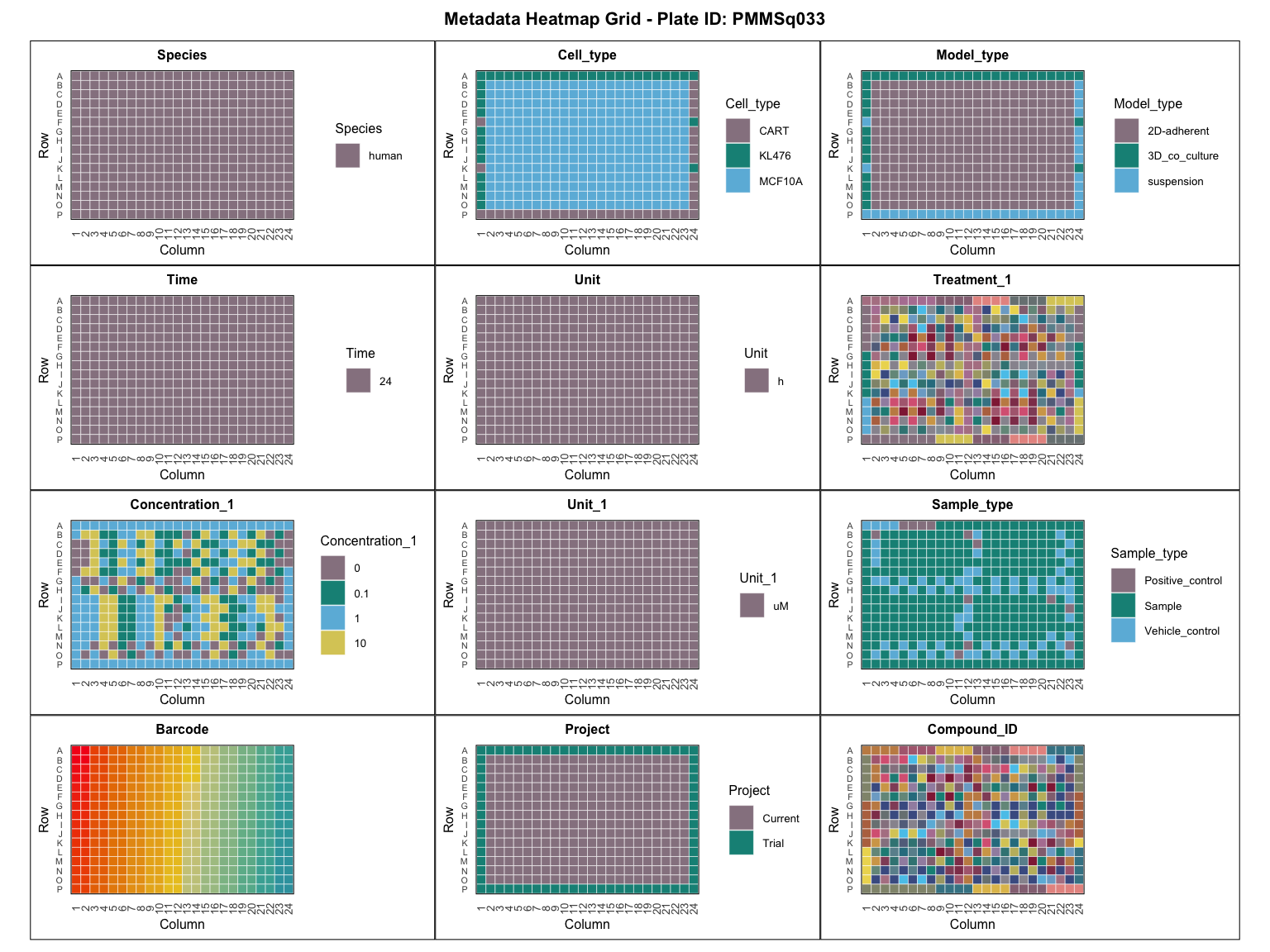
2. Quality control
2.1 Import data to tidySeurat object
Data access
The full dataset (>10 MB of.rdsfiles) is currently under restricted release and will become publicly available upon publication (at Zenodo).
In the meantime, please contact us for early access.
Data is imported into a tidySeurat object, which allows the usage of both the regular Seurat functions, as well as the functionality of tidyverse.
In case of multiple plates, instead of one directory submit a vector of directories (or named directories, where names will become barcode prefixes) to the Read10X function.
# Import raw data
#project_rawdata <- "/home/rstudio/macpie/macpieData/PMMSq033/raw_matrix/"
#raw_counts <- Read10X(data.dir = project_rawdata)

# 1. Load your own gene counts per sample or 2. data from the publication
project_rawdata <- paste0(dir, "/macpieData/PMMSq033/raw_matrix")
project_name <- "PMMSq033"
raw_counts <- Read10X(data.dir = project_rawdata)


#for multiple plates:
#raw_counts <- Read10X(data.dir = c("path1", "path2", ... "pathN"))

# Create tidySeurat object
mac <- CreateSeuratObject(counts = raw_counts,
                          project = project_name,
                          min.cells = 1,
                          min.features = 1)
#> Warning: Feature names cannot have underscores ('_'), replacing with dashes
#> ('-')

# Join with metadata
mac <- mac %>%
  inner_join(metadata, by = c(".cell" = "Barcode"))

# Add unique identifier
mac <- mac %>%
  mutate(combined_id = str_c(Treatment_1, Concentration_1, sep = "_")) %>%
  mutate(combined_id = gsub(" ", "", .data$combined_id))

# Filter by read count per sample group
mac <- filter_genes_by_expression(mac,
                                  group_by = "combined_id",
                                  min_counts = 10,
                                  min_samples = 2)
For example, we can use the common QC plots from the Seurat package to visualise the number of genes, reads, and percentage of mitochondrial and ribosomal genes per sample. Similar to single-cell experiments, higher amounts of mitochondrial and ribosomal expression can point to reduced quality of the samples.
# Calculate percent of mitochondrial and ribosomal genes
mac[["percent.mt"]] <- PercentageFeatureSet(mac, pattern = "^mt-|^MT-")
mac[["percent.ribo"]] <- PercentageFeatureSet(mac, pattern = "^Rp[slp][[:digit:]]|^Rpsa|^RP[SLP][[:digit:]]|^RPSA")

# Example of a function from Seurat QC
VlnPlot(mac, features = c("nFeature_RNA", "nCount_RNA", "percent.mt", "percent.ribo"),
        ncol = 4, group.by = "Sample_type") &
  scale_fill_manual(values = macpie_colours$discrete)
#> Warning: Default search for "data" layer in "RNA" assay yielded no results;
#> utilizing "counts" layer instead.
#> Warning: The `slot` argument of `FetchData()` is deprecated as of SeuratObject 5.0.0.
#> ℹ Please use the `layer` argument instead.
#> ℹ The deprecated feature was likely used in the Seurat package.
#>   Please report the issue at <https://github.com/satijalab/seurat/issues>.
#> This warning is displayed once every 8 hours.
#> Call `lifecycle::last_lifecycle_warnings()` to see where this warning was
#> generated.
#> Warning: `PackageCheck()` was deprecated in SeuratObject 5.0.0.
#> ℹ Please use `rlang::check_installed()` instead.
#> ℹ The deprecated feature was likely used in the Seurat package.
#>   Please report the issue at <https://github.com/satijalab/seurat/issues>.
#> This warning is displayed once every 8 hours.
#> Call `lifecycle::last_lifecycle_warnings()` to see where this warning was
#> generated.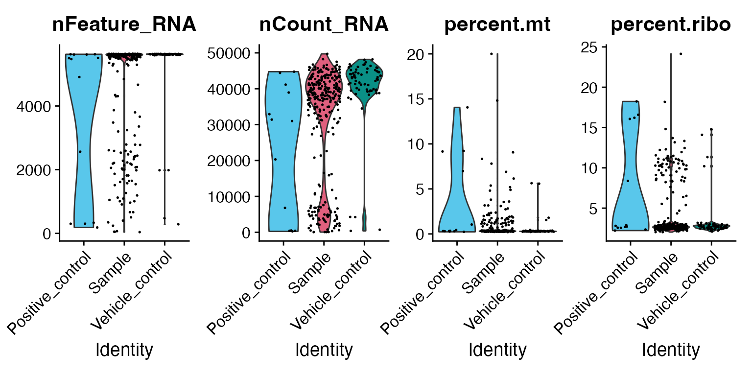
In addition, we can use tidyverse functions to further explore the dataset. For example, let’s subset the Seurat object based on the column “Project” in metadata and visualise the grouping of data on the plate vs on an MDS plot. Plate layout plots are useful for visualising any spatial anomalies or unexpected patterns.
unique(mac$Project)
#> [1] "Trial"   "Current"
mac <- mac %>%
  filter(Project == "Current")

# QC plot plate layout (all metadata columns can be used):
p <- plot_plate_layout(mac, "nCount_RNA", "combined_id")
girafe(ggobj = p,
  fonts = list(sans = "sans"),
  options = list(
    opts_hover(css = "stroke:black; stroke-width:0.8px;")  # <- slight darkening
  ))
2.2 Basic QC metrics
2.2.1 Sample grouping with MDS plot
As a first step, we should visualise grouping of the samples based on top 500 expressed genes and limma’s MDS function. As a warning, samples that are treated with a lower concentration of compound will often cluster close to the negative (vehicle) control. Hovering over the individual dots reveals sample identity and grouping.
p <- plot_mds(mac, group_by = "Sample_type", label = "combined_id", n_labels = 30)
#> tidyseurat says: Key columns are missing. A data frame is returned for independent data analysis.
#> tidyseurat says: Key columns are missing. A data frame is returned for independent data analysis.
girafe(ggobj = p, fonts = list(sans = "sans"))
#> Warning: ggrepel: 5 unlabeled data points (too many overlaps). Consider
#> increasing max.overlaps
2.2.2 Sample grouping with UMAP plot
Since we are operating from a standard Seurat object, we can also use the standard scRNA-seq workflow.
mac_sct <- SCTransform(mac, verbose = FALSE) %>%
  RunPCA(verbose = FALSE) %>%
  RunUMAP(dims = 1:30, verbose = FALSE)

# For standard Seurat approach use:
# DimPlot(mac_sct, reduction = "umap", group.by = "Sample_type", cols = macpie_colours$discrete)

umap_data <- cbind(Embeddings(mac_sct, "umap"), mac_sct@meta.data) %>%
  tibble::as_tibble(rownames = "cell") %>%
  mutate(
    tooltip = combined_id
  )

# Merge with metadata using Barcode == cell
p <- ggplot(umap_data, aes(x = umap_1, y = umap_2)) +
  geom_point_interactive(aes(color = Sample_type, tooltip = tooltip), size = 2) +
  scale_color_manual(values = macpie_colours$discrete) +
  theme_minimal()
girafe(ggobj = p, fonts = list(sans = "sans"))2.3.1 Distribution of read counts
In order to perform downstream analysis, we have to ensure that we have addressed technical variability and batch effects correctly. We will start of with the distribution of reads across the experiment. To that end we use box plot to show distribution of read counts grouped across treatments.
qc_stats <- compute_qc_metrics(mac, group_by = "combined_id", order_by = "median")
qc_stats$stats_summary
#> # A tibble: 83 × 6
#>    combined_id    sd_value mad_value group_median z_score   IQR
#>    <chr>             <dbl>     <dbl>        <dbl>   <dbl> <dbl>
#>  1 DMSO_0            3260.     3312.       43646    0.659 4788.
#>  2 Media_0           2947.     3175.       43178.   0.557 4830.
#>  3 Paclitaxel_0.1    6114.      752.       33167   -1.63  5417
#>  4 Paclitaxel_1      6606.     6050.       35783   -1.06  6462.
#>  5 Paclitaxel_10     5727.     5161.       30791   -2.15  5595
#>  6 SN01004236_0.1    2394.      595.       41474    0.184 2166
#>  7 SN01004236_1      3291.     1245.       45383    1.04  3036.
#>  8 SN01004236_10     4649.     6150.       41983    0.295 4640.
#>  9 SN01004272_0.1     987.      145.       41420    0.172  878
#> 10 SN01004272_1      3020.     2302.       38839   -0.392 2916
#> # ℹ 73 more rows
2.3.2 Variability among all replicates
In relation to the previous plot, we want the user to have the ability to assess the dispersion of reads within a sample. Therefore, we enabled access to several statistical metrics such as standard deviation (sd_value), robust z score (z_score), mad (mad_value) and IQR (IQR) which can be used as a parameter to the function plot_qc_metrics individually, or assessed at once with the function plot_qc_metrics_heatmap.
Standard deviation (sd_value) and interquartile range (IQR) both capture the spread of read counts within a single treatment condition. Use these when you want to understand how consistently reads cluster around the mean or median in one group.
Median absolute deviation (mad_value) and the robust z‐score (z_score) highlight variability between treatment conditions. They make it easy to spot conditions whose overall read distributions deviate from the rest of the plate.
As you can see below, Staurosporine had the largest variability between the samples across all metrics.
plot_qc_metrics_heatmap(qc_stats$stats_summary)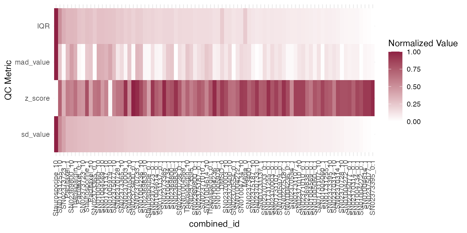
2.3.3 Variability within a sample
Due to the lower read counts per sample, MAC-seq is more variable than RNA-seq. It is therefore fairly important to estimate bioogical variability between the replicates. We provide a way to estimate inter-replicate variability using poisson distance within the function plot_distance.
plot_distance(mac, "combined_id", treatment = "DMSO_0")
#> tidyseurat says: A data frame is returned for independent data analysis.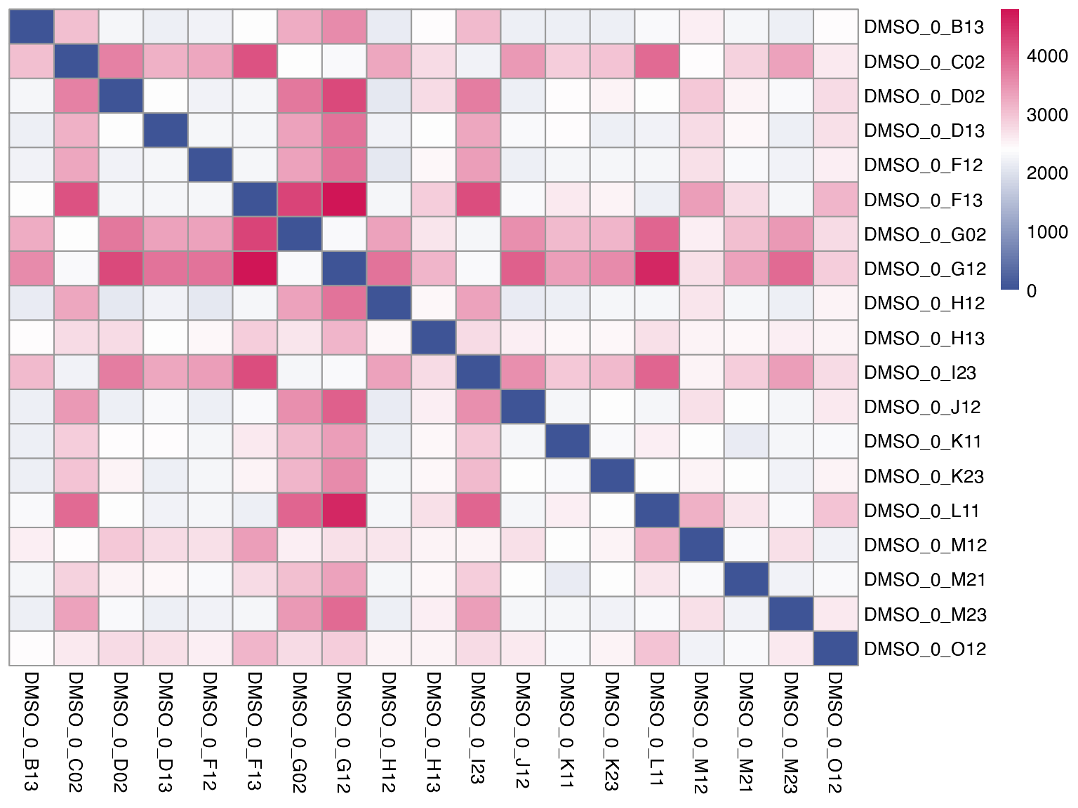
2.3.4 Evaluating the influecne of batch effects and normalizations
Several methods are available for scaling and normalizing transcriptomic data, with their effects most clearly visualized using RLE (Relative Log Expression) plots. In our case, limma_voom provides the lowest average coefficient of variation, when compared to other methods such as “raw”, Seurat “SCT” or “edgeR”. User can provide a vector of batches of the same length as the data - see example below.
# First we will subset the data to look at control, DMSO samples only
mac_dmso <- mac %>%
  filter(Treatment_1 == "DMSO")

# Run the RLE function for raw data
plot_rle(mac_dmso, label_column = "Row", normalisation = "raw")
#> tidyseurat says: Key columns are missing. A data frame is returned for independent data analysis.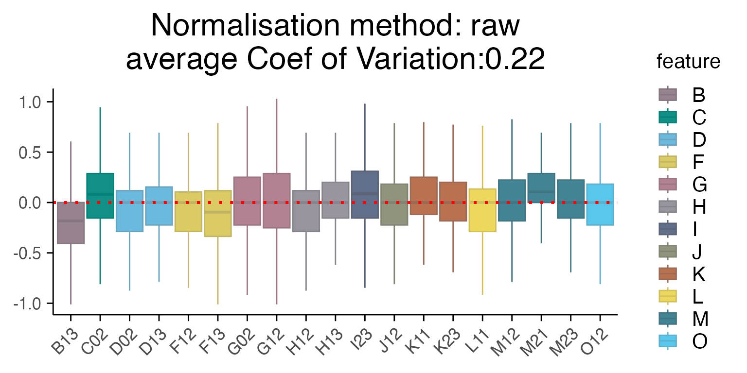
# Run the RLE function for normalised data
plot_rle(mac_dmso, label_column = "Row", normalisation = "limma_voom")
#> tidyseurat says: Key columns are missing. A data frame is returned for independent data analysis.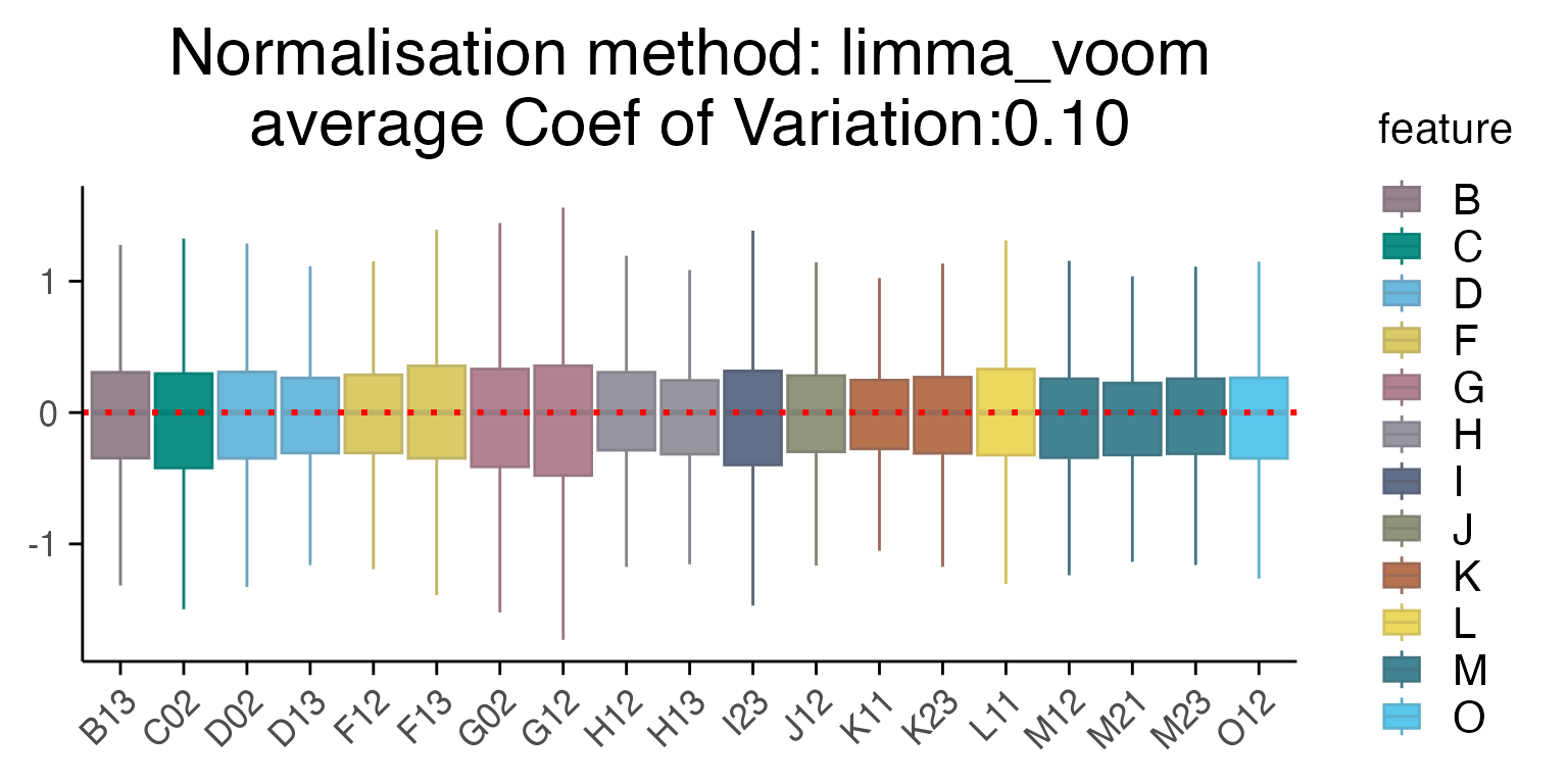
# For multiple plates, once can add a vector with batch factors
#plot_rle(mac_dmso, label_column = "Row", normalisation = "limma_voom", batch = mac_dmso$Plate_ID)